12 Landing Page Design Mistakes Killing Your Sales
Uncover 12 landing page design mistakes quietly killing your sales and get practical fixes to convert more visitors today.
Key Takeaways
-
One clear goal per landing page dramatically improves conversions; avoid asking visitors to call, buy, sign up, and follow social media simultaneously as this confusion kills results.
-
Page load speed is critical—even a one-second delay reduces conversions significantly, so compress images, remove unused plugins, and use reliable hosting to stay under three seconds.
-
Mobile optimization is mandatory, not optional; over 50% of traffic comes from phones, requiring large tap-friendly buttons, readable text without zooming, and simplified forms.
-
Match your ad copy exactly to landing page content and include trust signals like customer testimonials, star ratings, and security badges to build visitor confidence and reduce bounce rates.
You spent good money getting people to click your ad. Then they land on your page and leave in seconds. Sound familiar? You are not alone. Small business owners across Tampa, Brandon, and Riverview lose thousands of dollars every month because their landing page design pushes visitors away instead of pulling them in.
A landing page is the first real impression your business makes online. It is where clicks either turn into customers or disappear forever. The good news? Most landing page problems are easy to spot once you know what to look for. In this guide, we will walk through 12 common mistakes that hurt conversions, and show you exactly how to fix them.
Whether you run a local service business, manage an online store, or lead marketing for a growing startup, this list will help you build a page that actually works. Let’s dig in.
1. Ignoring a Clear, Single Goal
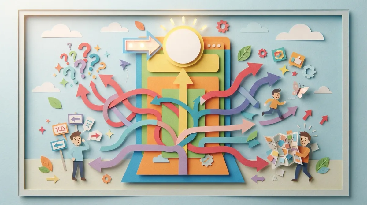
Many landing pages try to do too much. They ask visitors to call, buy, sign up, and follow social media all at once. This confuses people and kills conversions.
Every good landing page needs one job. Maybe it’s collecting emails. Maybe it’s booking a consultation. Pick one goal and build everything around it. If you need help narrowing your focus, our team offers website design services built around conversion, not clutter.
2. Weak or Confusing Headlines
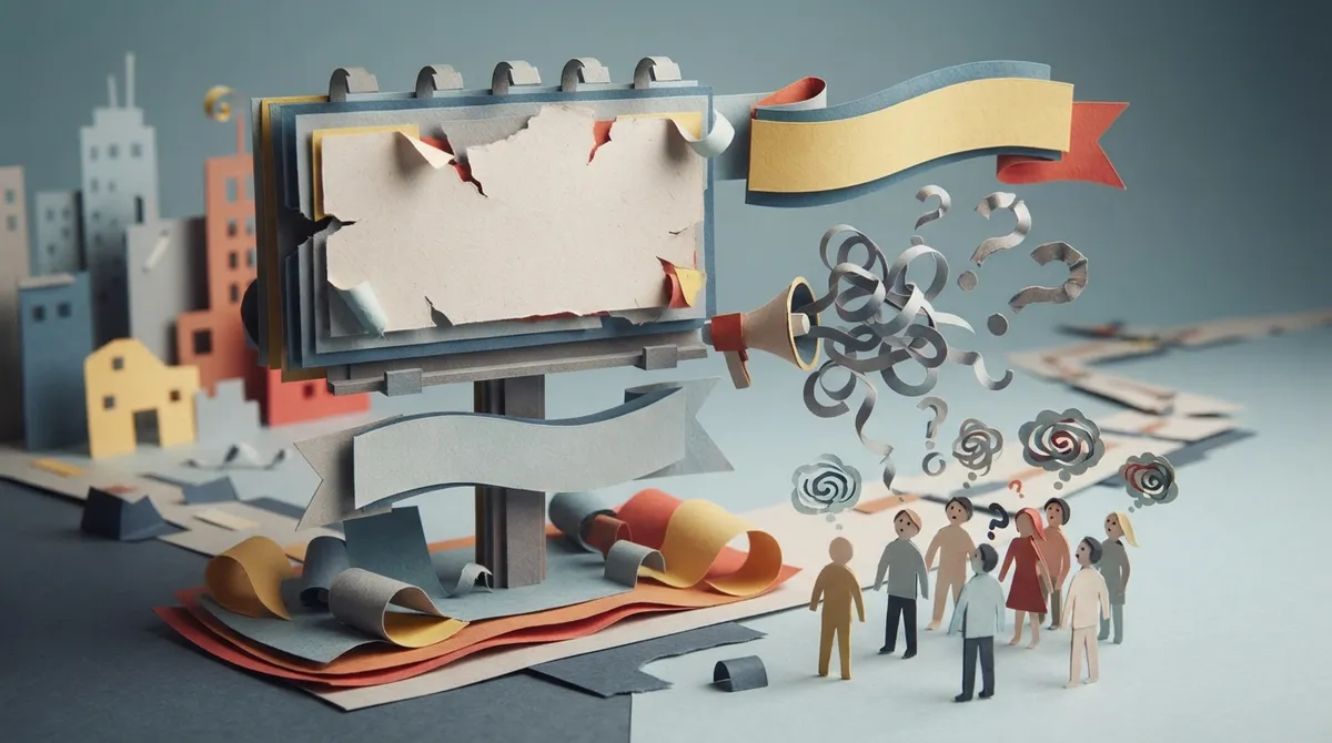
Your headline has about five seconds to grab attention. If it’s vague or boring, visitors leave immediately.
A strong headline answers one question fast: what’s in it for me? Skip clever wordplay. Say exactly what you offer and why it matters. Test a few versions to see which one keeps people on the page longer.
3. Slow Page Load Times
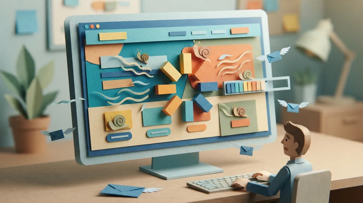
Speed kills or saves conversions. Studies show that even a one-second delay can drop conversions significantly. If your page takes more than three seconds to load, you are losing customers before they even see your offer.
Common culprits include huge images, bloated code, and cheap hosting. Solid WordPress Hosting makes a real difference here, along with compressing images and cutting unnecessary plugins.
Quick Speed Fixes
- Compress all images before uploading
- Remove unused plugins and scripts
- Use a reliable hosting provider
- Enable browser caching
- Limit the number of fonts and animations
4. No Mobile Optimization
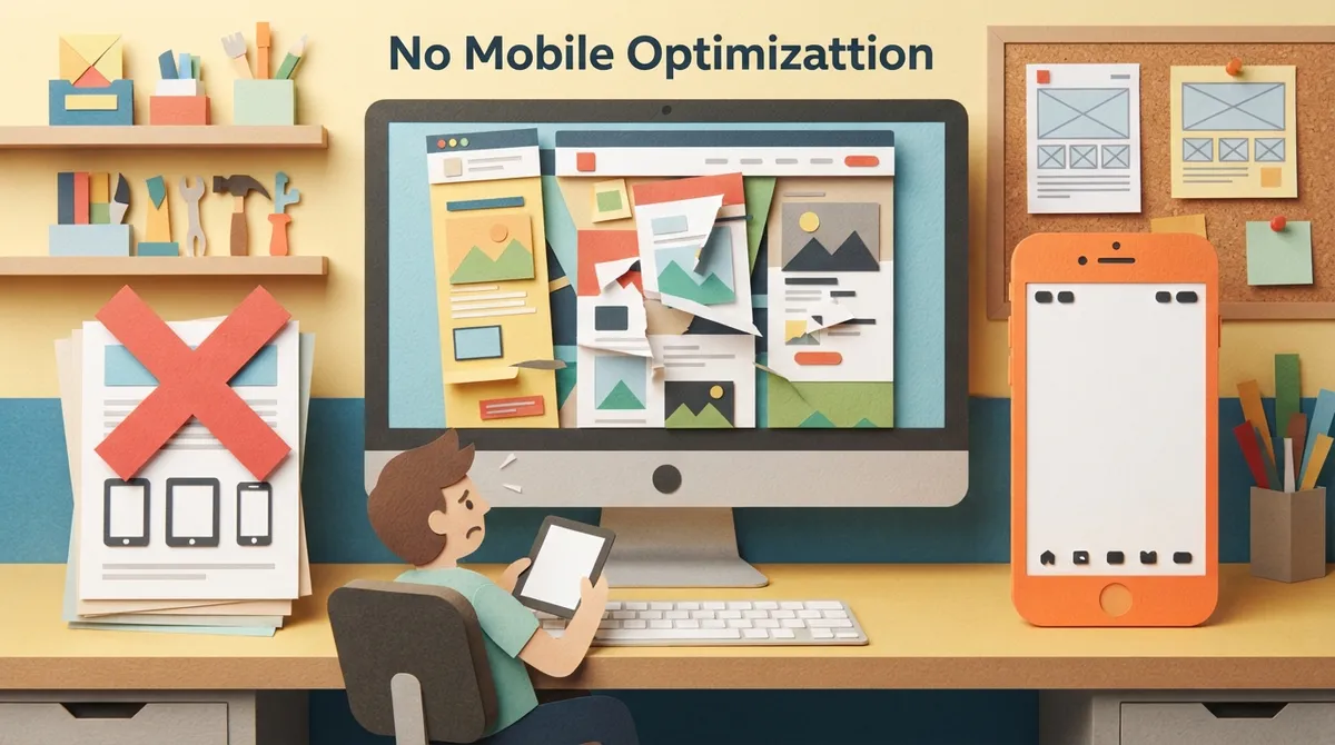
More than half of web traffic comes from phones. If your landing page looks broken or hard to use on mobile, you are turning away most of your visitors.
Buttons should be big enough to tap easily. Text should be readable without zooming. Forms should be short and simple to fill out on a small screen. Mobile-friendly design is not optional anymore. It’s the baseline.
5. Overwhelming Visitors With Too Much Text
Nobody wants to read a wall of text before deciding to buy. Long paragraphs and dense blocks of information scare people away.
Break your content into short sentences and small chunks. Use bullet points, bold text, and white space to guide the eye. Keep your message simple and focused on benefits, not features.
6. Missing or Buried Call-to-Action Buttons
Your call-to-action, or CTA, tells visitors exactly what to do next. If it’s hard to find or unclear, people won’t take action.
Your CTA button should stand out with contrasting colors. Use action words like “Get Started” or “Claim Your Spot” instead of generic terms like “Submit.” Place it above the fold and repeat it further down the page for long-form content.
7. Skipping Trust Signals
People are cautious online. Without proof that your business is legitimate, many visitors will hesitate to buy or share their information.
Trust signals include customer reviews, star ratings, security badges, and recognizable logos. Adding real feedback can make a huge difference. You can see how this works by checking out our Testimonials page, or by reading what actual clients say when you visit Brain Buzz Marketing on Google.
Trust Elements Worth Adding
| Trust Signal | Why It Works |
|---|---|
| Customer testimonials | Shows real people had a good experience |
| Star ratings | Quick visual proof of quality |
| Security badges | Reassures visitors their data is safe |
| Media mentions or awards | Builds credibility and authority |
| Money-back guarantees | Reduces risk for hesitant buyers |
8. Cluttered Design With Too Many Distractions
Sidebars, pop-ups, unrelated links, and busy backgrounds pull attention away from your main offer. A cluttered page confuses visitors and increases bounce rates.
Good design removes anything that doesn’t support your main goal. That means cutting extra navigation menus, unrelated blog links, and flashy animations that don’t add value. Clean pages convert better because they guide the eye naturally toward the action you want.
9. Forgetting to Match Ad Copy to Page Content
If someone clicks a Google ad promising a discount, but your landing page doesn’t mention it, they’ll bounce immediately. This mismatch breaks trust fast.
Your landing page message must match your ad copy word for word when possible. If you’re running paid campaigns, this consistency is critical. Learn more about aligning your ads and pages properly through our guide on How to Run Google Ads That Actually Drive Results.
10. Long, Complicated Forms
Every extra field on a form reduces your chances of getting a submission. Asking for too much information too soon feels invasive and time-consuming.
Stick to the basics: name, email, and maybe phone number. You can always gather more details later once someone becomes a lead. Simplifying your form is one of the fastest ways to boost conversions overnight.
Steps to Simplify Your Forms
- Remove any field that isn’t absolutely necessary
- Use auto-fill features when possible
- Break long forms into multiple short steps
- Add a progress bar for multi-step forms
- Test different form lengths to see what converts best
11. No Clear Value Proposition
Visitors want to know one thing fast: why should they choose you? If your page doesn’t answer that clearly, they’ll leave and find someone who does.
Your value proposition should be visible near the top of the page. Explain what makes your offer different and better. This is where good content writing services can make a real difference, helping turn a vague pitch into a compelling reason to act.
12. Ignoring SEO and AI Search Trends
Many businesses build a beautiful landing page, then forget it needs to actually get found. Without proper SEO, your page might never show up in search results at all.
Search is changing fast. AI-driven results and answer engines are becoming more common, which means your page needs to be built for both traditional search and newer AI-based discovery. According to Search Engine Journal’s guide on Google E-E-A-T, demonstrating real experience and trustworthiness matters more than ever for ranking well. Our team stays on top of these shifts, and you can explore our full range of digital marketing services to see how we approach this.
Bringing It All Together
Fixing these 12 mistakes won’t happen overnight, but even small changes can lead to big results. Start with the basics: clarify your goal, speed up your page, and simplify your forms. Then move on to trust signals, mobile design, and matching your ad copy.
If you want a professional set of eyes on your current page, Brain Buzz Marketing has been helping businesses since 1998. As a husband-and-wife owned agency, Eric and Nicole bring decades of hands-on experience to every project, offering the kind of dedicated attention that bigger agencies simply can’t match. You can learn more about their approach on the Our Story page, or check out real client work in the Portfolio section.
We also recommend following industry conversations for fresh insights. You can follow Eric on LinkedIn or connect with Nicole on LinkedIn for regular marketing tips. And if you’re curious about tools that support content creation, SEO Rocket offers fully automated blog posts built to rank, which pairs nicely with a strong landing page strategy.
Local businesses across Brandon, Riverview, and Tampa often ask for referrals to other trusted service providers. If you’re a homeowner or business needing outdoor upkeep alongside your marketing efforts, All Trusted Lawn Care is a solid choice for lawn care in the area.
Stay connected with us on Instagram and Facebook for more marketing tips and behind-the-scenes updates. Ready to turn your landing page into a customer-generating machine? Get in touch with our team today and let’s build something that actually converts.
FAQs
Q: What makes a landing page design effective?
A: An effective landing page has one clear goal, a strong headline, fast load times, and an obvious call-to-action. It also builds trust with reviews and testimonials while keeping forms short and simple.
Q: How long should a landing page be?
A: There’s no magic number here! It really depends on your offer. Simple products can use short pages, while services that need more explanation often benefit from longer pages with clear sections and plenty of white space.
Q: Why is my landing page not converting?
A: Common culprits include slow load times, confusing headlines, too many form fields, and a mismatch between your ad copy and page content. Start by checking your page speed and simplifying your call-to-action.
Q: Do I need a different landing page for every ad campaign?
A: Yes, ideally! Matching your landing page message to each specific ad keeps your messaging consistent and builds trust with visitors. It also tends to improve your Quality Score in Google Ads, which can lower your cost per click.
Q: How much does professional landing page design cost?
A: Costs vary based on the number of pages, features needed, and whether you want e-commerce capabilities or a content management system. We’re happy to chat about your specific needs and put together a plan that fits your budget.
Our Service Area