Why Does Mobile First Website Design Win More Customers?
Learn why mobile first website design boosts SEO, conversions, and customer trust for small businesses in 2026.

Key Takeaways
-
Google uses mobile-first indexing to rank websites, meaning your mobile site's performance directly impacts your search rankings across all devices—a slow mobile experience hurts visibility even on desktop searches.
-
Over half of all web traffic now comes from phones and tablets, making mobile-first design essential; customers will bounce in seconds if your site loads slowly or displays poorly on their screen.
-
Mobile-first design starts with small screens and builds up, prioritizing only essential content and features, unlike responsive design which shrinks desktop layouts down—this creates faster, cleaner user experiences.
-
Local service businesses (plumbers, dentists, landscapers) must prioritize mobile since customers search 'near me' on phones in urgent situations; fast load times and click-to-call buttons convert browsers into customers instantly.
-
Common mobile mistakes like oversized images, full-screen pop-ups, tiny text, and desktop-only navigation sabotage performance; AI tools now rely on fast, clear mobile sites to accurately recommend your business.
-
When redesigning your website, ask your design partner specific questions about mobile-first construction, load time testing, Core Web Vitals performance, and thumb-friendly optimization to ensure your investment pays off.
Picture this: someone in Brandon is standing in line for coffee, phone in hand, searching for a local business just like yours. If your website takes forever to load or looks jumbled on their screen, they’ll bounce in seconds. That split-second decision happens millions of times a day, and it’s exactly why mobile first website design has become the heart of smart digital marketing strategy in 2026.
Here at Brain Buzz Marketing, we’ve watched search habits shift dramatically over the years. More than half of all web traffic now comes from phones and tablets. If your site wasn’t built with mobile in mind from the start, you’re likely losing customers before they even see what you offer. Let’s walk through why this approach matters so much, and how it can transform your online presence.
What Is Mobile First Website Design, Really?
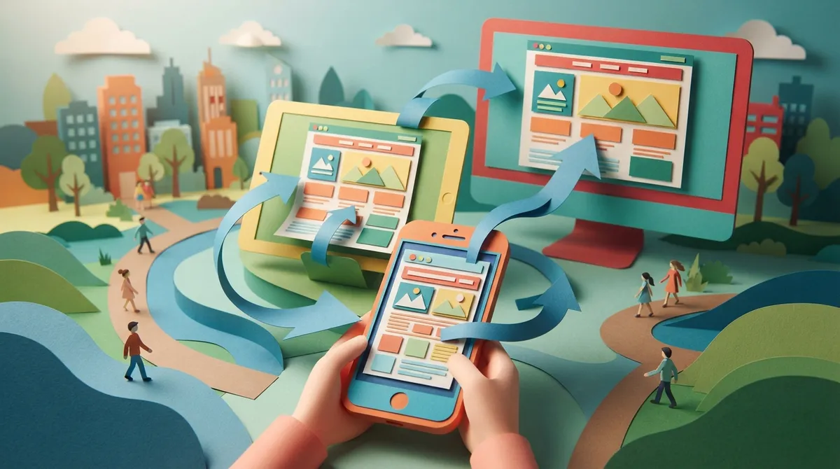
Mobile first website design means building your website for small screens before you ever think about desktops. Instead of shrinking a big, cluttered desktop site down to fit a phone, designers start small and build up. This creates a cleaner, faster, more focused experience for the majority of your visitors.
This isn’t just a trendy buzzword. Google itself uses mobile-first indexing, meaning it primarily looks at the mobile version of your site to decide how you rank in search results. If your mobile experience is clunky, your SEO rankings can take a real hit, no matter how great your desktop site looks.
The Difference Between Responsive and Mobile First
These terms get mixed up a lot, so let’s clear things up. Responsive design adjusts an existing layout to fit different screen sizes. Mobile first design flips the whole process, starting with the smallest screen and adding features as space allows. Think of it like packing a suitcase: mobile first means you pack the essentials first, then add extras if there’s room left.
- Responsive design: Starts big, scales down, sometimes leaving clutter behind
- Mobile first design: Starts small, prioritizes what matters most to users
- Adaptive design: Uses set layouts for specific screen sizes, less flexible overall
- Mobile first + responsive: The gold standard combo most modern agencies use today

Why Small Business Owners Can’t Ignore This Trend
If you’re running a small business, your customers are searching for you on the go. They’re checking hours before a road trip, comparing prices while waiting in line, or reading reviews from their couch. A slow or confusing mobile site sends them straight to your competition.
We’ve seen this firsthand while helping local business owners across Tampa, Brandon, and Riverview. Businesses that invest in website design built around mobile users tend to see longer visit times, more phone calls, and better conversion rates overall.
Key Benefits for Local Service Providers
Local service businesses, think plumbers, dentists, landscapers, live and die by mobile searches. Someone with a burst pipe isn’t sitting at a desktop computer. They’re grabbing their phone and typing “plumber near me” in a panic.
- Faster load times keep panicked or busy customers from leaving
- Click-to-call buttons turn browsers into phone calls instantly
- Easy-to-tap menus help users find services without frustration
- Location-based content supports strong local SEO services results

How Mobile First Design Impacts Your SEO Rankings
Google has made it clear: mobile experience is a ranking factor. Since the search engine crawls your mobile site first, a slow or broken mobile layout can drag down your entire site’s visibility, even on desktop searches.
This ties directly into concepts like Core Web Vitals, which measure loading speed, interactivity, and visual stability. Sites that score poorly here often see fewer organic visitors. If you want to learn more about how search behavior has changed, our article on what local search engine optimization means for your business breaks it down further.
| Ranking Factor | Why It Matters on Mobile | Impact on Rankings |
|---|---|---|
| Page Load Speed | Mobile users expect pages under 3 seconds | High |
| Tap-Friendly Buttons | Prevents mis-clicks and frustration | Medium |
| Readable Text Without Zooming | Improves time on page and engagement | High |
| Mobile-Friendly Navigation | Helps users find what they need fast | Medium |

E-commerce Retailers: Why Mobile Checkout Makes or Breaks Sales
If you sell products online, your mobile checkout process can be the difference between a sale and an abandoned cart. Studies show a huge chunk of online shoppers browse on their phones, even if they eventually purchase on a desktop. But many still complete purchases directly from mobile, especially with saved payment options like Apple Pay or Google Pay.
A clunky checkout with tiny buttons or confusing forms will send shoppers running. We cover more on this topic in our guide about must-have features for ecommerce websites in 2026, which pairs perfectly with a mobile-first approach.
Simple Fixes That Boost Mobile Conversions
- Use large, easy-to-tap “Add to Cart” and “Buy Now” buttons
- Shorten checkout forms to only essential fields
- Display trust badges and reviews prominently near the top
- Offer guest checkout so customers don’t have to create an account
What Marketing Managers Should Know Before Approving a Redesign
If you’re the one greenlighting budgets and strategies, mobile first design should be part of every conversation about your company’s digital presence. It’s not just a design preference, it’s a business decision that affects lead generation, brand perception, and ad performance.
When you run Google Ads management campaigns, your landing pages need to match the speed and quality your ads promise. A beautiful ad that leads to a slow, hard-to-navigate mobile page wastes ad spend and hurts your quality score.
Questions to Ask Your Web Design Partner
- Was this site built mobile first, or adapted from a desktop layout?
- What is the average mobile load time, and how was it tested?
- Are buttons and forms optimized for thumb-friendly tapping?
- How does the site perform on Google’s Core Web Vitals report?
Startups: Building Your Digital Foundation the Right Way
If you’re launching a new company, you have a unique advantage. You get to build your website right from day one instead of fixing years of outdated design choices. Starting with mobile first website design means you won’t have to go back and rebuild everything later.
Since most startups have limited budgets, it makes sense to prioritize features that deliver the biggest impact. A clean, fast, mobile-optimized site paired with strong content writing services gives you a solid foundation to grow on without wasting resources on unnecessary extras.
Common Mistakes That Hurt Mobile Performance
Even well-meaning business owners make mistakes that quietly sabotage their mobile experience. Here are the ones we see most often when auditing client sites.
- Oversized images: Huge photo files slow load times dramatically
- Pop-ups that cover the whole screen: These frustrate users and hurt Google rankings
- Tiny text: Forces users to pinch and zoom, which feels clunky
- Desktop-only navigation menus: Confusing dropdowns don’t translate well to touchscreens
- Ignoring page speed testing: You can’t fix what you don’t measure
According to Google E-E-A-T guidelines, user experience plays a growing role in how content is judged for quality and trustworthiness. A frustrating mobile site sends the wrong signal to both users and search engines.
Steps to Improve Your Mobile First Website Design
Ready to make changes? Here’s a simple roadmap to get your site into shape.
- Audit your current mobile experience: Test your site on multiple devices and note pain points
- Simplify your navigation: Stick to a clean, easy-to-tap menu structure
- Compress images and files: Faster load times keep visitors from bouncing
- Prioritize your most important content: Put key information above the fold
- Test forms and buttons: Make sure everything is thumb-friendly
- Check your Core Web Vitals: Use tools like Google PageSpeed Insights regularly
- Work with experts who understand SEO, GEO, and AEO: Modern content needs to perform for search engines and AI-driven results alike
This last step matters more than ever. Search is evolving beyond traditional Google results. Answer Engine Optimization and Generative Engine Optimization are shaping how AI tools recommend businesses. Our piece on what answer engine optimization is and how to do it explains this shift in plain language.
How Brain Buzz Marketing Approaches Mobile First Projects
As a small but mighty, 100% virtual agency founded back in 1998, Brain Buzz Marketing has watched the web evolve from dial-up to mobile-dominant browsing. Eric and Nicole built this business on the idea that clients deserve high-end results without the inflated price tag of a big agency.
Every custom website we build starts with mobile users in mind. We pair that foundation with keyword-targeted content, smart digital marketing services, and ongoing SEO strategy so your site doesn’t just look good, it performs. You can see examples of our work and read about our approach on our about page, or check out testimonials from business owners across Tampa Bay.
We proudly serve businesses throughout Brandon, Riverview, Valrico, Apollo Beach, Tampa, St. Pete, Clearwater, and Westchase, along with clients across Florida and beyond. Want to see what our community says about working with us? Visit us on Google — Brain Buzz Marketing to read real reviews from real clients.
Mobile First Design and the Future of Search
Search is changing fast. AI tools like ChatGPT and Google’s AI Overviews are pulling information directly from websites to answer questions instantly. If your site isn’t fast, clear, and mobile-friendly, it’s harder for these tools to pull accurate information about your business too.
This is where GEO and AEO come into play alongside traditional SEO. Building a mobile first foundation isn’t just about pleasing human visitors anymore, it’s about making sure AI systems can read, understand, and recommend your business accurately. We dive deeper into this topic in our article about how to get your business recommended by AI search.
You can also follow industry conversations and updates through our team’s professional networks. Follow Eric on LinkedIn or follow Nicole on LinkedIn for insights on where digital marketing is headed next. We also share updates on Instagram and Facebook.
A Quick Comparison: Old Approach vs. Mobile First Approach
| Design Element | Old Desktop-First Approach | Mobile First Approach |
|---|---|---|
| Starting Point | Large screen layout, then shrink down | Small screen layout, then expand up |
| Content Priority | Everything crammed onto one page | Only essentials shown first |
| Load Speed | Often slow due to heavy elements | Optimized for quick loading |
| SEO Performance | Weaker under mobile-first indexing | Stronger alignment with Google standards |
Ready to Build a Site That Works as Hard as You Do?
Your customers are searching for you right now, probably on their phones. A mobile first website design isn’t a luxury anymore, it’s the baseline for staying competitive in 2026. Whether you’re a startup building your very first site or an established business ready for a redesign, getting this foundation right pays off in traffic, trust, and sales.
If you’re ready to talk through what a mobile first approach could look like for your business, our team would love to help. Contact Us today and let’s build something that works beautifully on every screen your customers use.
FAQs
Q: What does mobile first website design actually mean?
A: It means your website is built for phones and tablets first, then scaled up for desktops. This ensures the most common way people browse today gets the best experience, instead of being an afterthought.
Q: Does mobile first design really affect my SEO rankings?
A: Absolutely! Google uses mobile-first indexing, which means it looks at your mobile site to determine your rankings. A slow or clunky mobile experience can hurt your visibility across all devices, so it’s worth getting right.
Q: How do I know if my current website needs a mobile first redesign?
A: If your site loads slowly on phones, has tiny buttons, or requires lots of pinching and zooming, it’s probably time for an update. Running a quick test on Google’s PageSpeed Insights can also reveal helpful clues.
Q: Is mobile first design only important for e-commerce sites?
A: Not at all! Every type of business benefits, from local service providers to startups to marketing teams running ad campaigns. Anyone with website visitors browsing on phones needs this foundation in place.
Q: How long does it take to redesign a website with mobile first principles?
A: It really depends on your site’s size and complexity, but most projects take a few weeks from planning to launch. Working with an experienced team helps keep the process smooth and stress-free.
Our Service Area