How to Get Responsive Web Design in Brandon, FL (2026)
Get responsive web design in Brandon, FL with easy steps, smart pricing tips, and advice on choosing the right design partner.
Key Takeaways
-
Test your site on your own phone today: check readability without zooming, thumb-friendly buttons, one-tap click-to-call, and fast-loading images. Any 'no' means room for improvement.
-
Google mostly ranks the mobile version of your site, so a clunky mobile layout can hurt local visibility as well as lose customers who search on their phones.
-
Include essentials in a responsive build: mobile-first layout, load times under 3 seconds, a phone number on every page, compressed images, and body text at 16px or larger.
-
Pick your build route carefully: DIY builders are cheap but limited, templates can look generic and slow, while custom responsive design offers speed, uniqueness, and SEO from day one.
-
Pair your responsive site with local SEO and landing pages for Google Ads, since ad clicks sent to a non-mobile-friendly page waste budget.
-
After launch, track mobile bounce rate, page load time, calls and form fills, and local search rankings to confirm the site is turning visitors into customers.
Picture this. A neighbor in Brandon grabs her phone, searches for a local plumber, and taps your website. The text is tiny. The buttons overlap. She has to pinch and zoom just to find your phone number. Three seconds later, she’s gone, and she’s calling your competitor instead. Ouch.
That’s exactly why responsive web design in Brandon, FL matters so much right now. In 2026, most local searches happen on phones, and people expect websites to just work on any screen. If yours doesn’t, you’re losing customers every single day without even knowing it.
The good news? Getting a responsive site isn’t as scary as it sounds. In this friendly, step-by-step guide, we’ll walk you through what responsive design really means, how to check your current site, what to ask for, and how to get a site that looks great and turns visitors into customers. Whether you run a small shop, a local service business, or a growing company, you’ll find simple steps you can use today. Let’s dive in!

What Is Responsive Web Design (and Why Should You Care)?
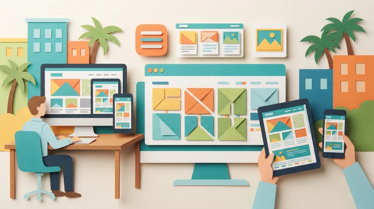
Responsive web design means your website automatically adjusts to fit any screen size. Phone, tablet, laptop, or giant desktop monitor, the layout rearranges itself so everything stays easy to read and easy to click.
Think of it like water poured into a glass. The water takes the shape of whatever container it’s in. A responsive website does the same thing with every device.
Here’s what a responsive site does behind the scenes:
- Flexible layouts: Columns stack neatly on small screens and spread out on large ones.
- Scalable images: Pictures shrink or grow so they never get cut off.
- Readable text: Fonts adjust so nobody has to squint.
- Touch-friendly buttons: Links and buttons are big enough for a thumb to tap.
Google also prefers mobile-friendly sites. Since Google mostly looks at the mobile version of your page when deciding rankings, a clunky mobile site can hurt your visibility. That’s why responsive design and SEO go hand in hand.

Why Responsive Design Matters for Brandon, FL Businesses
Brandon is a busy, growing community. People here search on the go. They look up restaurants from the car, check service hours from the couch, and compare prices while standing in a store. If your site isn’t ready for those moments, you miss out.
Here’s why it matters for local business owners:
- Most local searches happen on mobile. People searching “near me” are usually on their phones and ready to act.
- Slow or broken sites lose trust. A messy mobile layout makes your business look outdated, even if you’re amazing at what you do.
- Google rewards mobile-friendly sites. Better mobile experience can help you rank higher in local results.
- One site is easier to manage. A single responsive site beats maintaining separate desktop and mobile versions.
If you’re also working on local visibility, check out what local SEO is and why it’s important. A responsive site is the foundation that makes all your local marketing work harder.

Step 1: Test Your Current Website
Before you spend a dime, find out where you stand. This takes about ten minutes, and you don’t need to be techy.
Do the Quick Phone Test
Pull up your website on your phone and ask yourself these questions:
- Can I read the text without zooming in?
- Are the buttons easy to tap with my thumb?
- Does the menu open and close smoothly?
- Does my phone number work with one tap?
- Do images load fast and fit the screen?
If you answered “no” to even one, your site has room to grow.
Use Free Testing Tools
You can also run your site through free tools like Google’s PageSpeed Insights and Lighthouse. They’ll show your mobile score and point out problems. Don’t worry if the score looks scary at first. Most sites have fixable issues, and that’s what a good designer is for.
Check Your Analytics
Open Google Analytics and look at your mobile traffic. If lots of people visit on phones but leave quickly, that’s a red flag. A high bounce rate on mobile often means your design isn’t working for them.
Step 2: Know What a Great Responsive Site Includes
Not every “mobile-friendly” site is truly great. Here’s a simple checklist so you know what to look for when you hire a pro.
| Feature | Why It Matters | What to Look For |
|---|---|---|
| Mobile-first layout | Most visitors are on phones | Design starts small, then scales up |
| Fast load speed | Slow sites lose visitors | Under 3 seconds on mobile |
| Clear navigation | Helps people find what they need | Simple menu with tap-friendly links |
| Click-to-call buttons | Turns visitors into leads | Phone number visible on every page |
| Optimized images | Keeps pages light and quick | Compressed, properly sized photos |
| Readable fonts | Improves user experience | 16px or larger body text |
For an even deeper look at what separates a great site from a so-so one, read 7 web design principles that drive real business results.
Step 3: Decide Between Template, DIY, or Custom Design
This is where many Brandon business owners get stuck. Let’s make it easy.
DIY Website Builders
Drag-and-drop builders are cheap and fast. They can work if you’re just starting out and have a tiny budget. The downside? They often have limited design control, slower speeds, and weak SEO options. Many owners start here and then outgrow it.
Template Sites
Templates give you a head start, but they can feel generic. Lots of businesses end up looking alike. Templates can also carry extra code that slows your site down.
Custom Responsive Design
A custom site is built around your business, your customers, and your goals. It loads faster, looks unique, and is set up for SEO from day one. It’s the best choice if you want your site to actually bring in leads, not just sit there looking pretty.
Curious about the differences? Take a look at DIY website builders vs. custom design to see which fits your situation.
Step 4: Understand Pricing Before You Start
Nobody likes surprise bills. Knowing the typical cost range helps you plan with confidence. At Brain Buzz Marketing, our packages are clear and affordable:
| Package | Price | Best For |
|---|---|---|
| Starter Website | $800 | Startups and small businesses needing a professional online presence (up to 5 pages) |
| Growth Website | $1,500 | Established businesses needing more content, services, or locations (10 pages plus a blog) |
| Ecommerce Website | Starting at $2,500 | Businesses selling products online (up to 10 pages and 10 products) |
Not sure which one fits? Try our website price estimator to get a clearer number for your needs. You can also browse our website pricing page for more details. And if you want to plan your whole budget, our guide to budgeting for website design cost in 2026 breaks it down nicely.
Step 5: Choose the Right Responsive Design Partner
The right partner makes all the difference. Here’s what to look for when you’re hiring someone for responsive web design in Brandon, FL.
- Experience you can trust. Look for a team that’s been around the block. Brain Buzz Marketing has been helping businesses since 1998.
- A mobile-first mindset. Ask how they design for phones first. If they hesitate, keep looking.
- SEO built in. A pretty site that nobody finds won’t help. Make sure search optimization is part of the plan.
- Clear communication. You should always know what’s happening and when.
- Real results and reviews. Check testimonials and past work to see how they’ve helped others.
You can see how we work by checking out our portfolio and reading our testimonials. If you’re wondering who stands out locally, our post on the best website design agency in Brandon, FL is a helpful read. We also love sharing what to expect in our custom website design process.
Want to hear what customers say about us? See what our Brain Buzz Marketing clients share in our reviews on Google.
Step 6: Plan Your Responsive Design Process
Once you pick a partner, here’s what a smooth project usually looks like. Knowing the steps helps you feel relaxed and in control.
- Discovery. You share your goals, your customers, and your must-haves.
- Planning and layout. The team maps out pages and how they’ll flow on every screen.
- Design. Colors, fonts, and images come together to match your brand.
- Build and test. The site gets built and tested on real phones, tablets, and computers.
- Review and tweak. You give feedback, and changes are made.
- Launch. Your new site goes live, ready to impress.
Since we’re a 100% virtual agency, everything happens online. That means easy scheduling, quick updates, and no driving across town. Our team works with clients all across Brandon, Riverview, Valrico, Tampa, and beyond, plus businesses all over Florida and the United States.
Step 7: Combine Responsive Design with SEO and Ads
A responsive website is a powerful start, but it works even better when paired with smart marketing. Think of your website as a store. Responsive design builds a beautiful, easy-to-walk-through store. SEO and ads send the customers through the door.
Local SEO
Local SEO helps you show up when Brandon neighbors search for what you offer. A fast, mobile-friendly site gives you a head start. Learn more about local SEO services and how they fit with your site.
Google Ads
If you want quick traffic, Google Ads management can put you in front of ready-to-buy customers right away. But here’s a tip: sending ad clicks to a non-responsive site wastes money. A mobile-friendly landing page helps every ad dollar work harder. We explain why in why a professionally built website matters for Google Ads success.
AI Search Visibility
Search is changing fast. People now ask AI tools for recommendations, so your site should be clear, well-structured, and easy for AI to understand. Our guide on optimizing for AI search results in 2026 shows you how.
Want to see how everything connects? Explore our full range of digital marketing services.
Common Responsive Design Mistakes to Avoid
Even good intentions can go sideways. Watch out for these common slip-ups:
- Hiding important info on mobile. Don’t bury your phone number or contact form.
- Using huge, uncompressed images. They slow everything down.
- Ignoring tablet screens. Many designs only think about phones and desktops.
- Tiny buttons and links. Fat thumbs need room to tap.
- Skipping real-device testing. Emulators help, but nothing beats checking on actual phones.
- Forgetting about speed. A pretty site that crawls is still a bad site.
If you’re worried your current site has some of these issues, you may be ready for a refresh. Our post on 7 signs it’s time for a website redesign in 2026 can help you decide.
How to Measure Success After Launch
Your new site is live. Now what? Keep an eye on a few simple numbers to see if it’s working:
- Mobile bounce rate: Is it dropping?
- Page load time: Is it staying under three seconds?
- Phone calls and form fills: Are more people reaching out?
- Search rankings: Are you climbing for local terms?
- Time on site: Are visitors sticking around longer?
Good tracking tells you what’s working and what needs a tweak. That’s the beauty of a site that’s built with data in mind. If you’d like help with this, our analytics and reporting roadmap is a great place to start.
Your Next Step Toward a Site That Works Everywhere
Getting great responsive web design in Brandon, FL doesn’t have to be complicated. Test your current site, know what to look for, pick the right option for your budget, and partner with a team that cares about your success. Do those things, and you’ll have a website that looks amazing on every screen and brings real customers through your door.
At Brain Buzz Marketing, we’re a small but mighty team led by Eric and Nicole, and we’ve been helping businesses grow online since 1998. You can learn more about Brain Buzz Marketing and our story. You can also follow Eric on LinkedIn for more marketing tips, or keep up with us on Instagram. If you love learning about how content gets found, you might also enjoy a look at SEO Rocket, which offers fully automated blog posts that rank.
Ready to see what a mobile-friendly, customer-winning website can do for you? Contact us today and let’s talk about your goals. We’d love to help you build something you’re proud of!
FAQs
Q: What is responsive web design?
A: Responsive web design is a way of building a website so it automatically adjusts to fit any screen, from a phone to a big desktop monitor. Your text, images, and buttons rearrange themselves so everything stays easy to read and use. It’s the best way to give every visitor a great experience.
Q: How much does responsive web design cost in Brandon, FL?
A: It depends on the size of your site. At Brain Buzz Marketing, our Starter Website is $800 for up to 5 pages, the Growth Website is $1,500 for 10 pages and a blog, and ecommerce sites start at $2,500. You can also use our website price estimator for a custom number.
Q: Does responsive design help with SEO?
A: Yes, it really does! Google mostly looks at the mobile version of your site when deciding rankings, so a mobile-friendly design can help you show up higher. Faster load times and easier navigation also keep visitors happy, which sends good signals to search engines.
Q: How long does it take to build a responsive website?
A: Timelines vary based on the number of pages and how quickly feedback comes in. Many small business sites take a few weeks from start to launch. Since we work 100% virtually, planning and approvals move along smoothly.
Q: Can I just make my existing website responsive?
A: Sometimes, yes. If your site is built on a modern platform, a designer may be able to update it. But older sites often need a full redesign to work well on all devices. A quick review can tell you which path makes the most sense for your business.
Our Service Area