
Key Takeaways
-
Prioritize mobile-first design by creating websites that work seamlessly on smartphones, as over 60% of web traffic now comes from mobile devices.
-
Leverage your website as a primary owned platform, using social media as a discovery tool to drive traffic back to your central hub.
-
Implement contextual and adaptive UI that personalizes content based on user context like time, location, and browsing history to enhance engagement.
-
Use typography strategically as a core brand identity element, choosing fonts that communicate your brand's tone and ensure readability across devices.
-
Incorporate subtle sensory elements like micro-animations and textured backgrounds to create immersive experiences without compromising website performance.
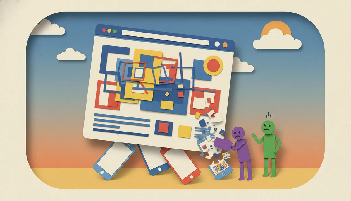
In 2026, website design has evolved into a sophisticated blend of aesthetics, functionality, and user psychology. Whether you’re a business owner in Brandon, Florida, or anywhere else, the mistakes you make in your website design can directly impact your bottom line. Understanding what not to do is just as important as knowing what works. Let’s explore the critical website design mistakes that are costing businesses customers and revenue, and how you can avoid them to create a high-converting online presence.
The landscape of web design continues to shift dramatically, with new trends like micrographics, contextual UI, and sensory elements reshaping how users interact with digital experiences. However, many businesses fall into common traps that undermine their online effectiveness. These mistakes range from ignoring mobile responsiveness to overlooking the power of owned platforms. By identifying and correcting these errors, you can transform your website from a digital liability into a powerful marketing asset that converts visitors into loyal customers.
Ignoring Mobile-First Design Principles
One of the most damaging mistakes in modern website design is failing to prioritize mobile users. With over 60% of web traffic coming from mobile devices in 2026, a website that doesn’t perform flawlessly on smartphones and tablets is essentially turning away the majority of potential customers. Mobile-first design isn’t just about making your site smaller—it’s about rethinking the entire user experience for touch-based navigation and smaller screens.
Many businesses make the error of designing for desktop first and then trying to squeeze that experience onto mobile devices. This backward approach leads to slow loading times, difficult navigation, and frustrated users who quickly abandon your site. Instead, start with the mobile experience and scale up to desktop. This ensures your core content and functionality work perfectly where most users will encounter them first.
Additionally, mobile-first design aligns with Google’s mobile-first indexing approach, which means your mobile site is what Google primarily uses for ranking and indexing. A poor mobile experience doesn’t just frustrate users—it actively harms your SEO performance. Test your website regularly on actual mobile devices, not just browser simulators, to catch issues that might not be apparent otherwise.

Overlooking the Power of Owned Platforms
A critical mistake businesses make is relying too heavily on social media platforms while neglecting their own website. Traditional platforms like LinkedIn and Instagram show declining reach and engagement in 2026, driving smart marketers to shift focus to owned audience platforms. Your website is the only digital property you truly control, and it should be the foundation of your online presence.
Personal websites and newsletters are gaining traction as creators and businesses reduce reliance on algorithm-driven social media. When you build your audience on someone else’s platform, you’re subject to their rules, algorithms, and changes. A single policy shift can devastate your reach overnight. Your website, however, remains stable and under your complete control.
This doesn’t mean abandoning social media entirely, but it does mean using those platforms to drive traffic back to your owned properties. Think of social media as a tool for discovery and engagement, while your website serves as the central hub for conversions and deeper relationships. Integrate email capture prominently on your site to build a direct communication channel with your audience.

Neglecting Contextual and Adaptive UI Elements
Modern users expect personalized experiences, yet many websites still deliver the same static content to everyone. Contextual and adaptive UI tailors content based on user context like time, location, or weather, enhancing relevance and reducing friction. This approach can dramatically improve engagement and conversion rates by showing users exactly what they need when they need it.
For example, a restaurant website could display breakfast menu items in the morning, lunch specials at midday, and dinner options in the evening. An e-commerce site might highlight rainy-day products when the weather forecast calls for storms in the user’s location. These subtle adjustments make the experience feel intuitive and thoughtful, building trust with visitors.
The mistake businesses make is treating every visitor the same regardless of their context. This one-size-fits-all approach wastes opportunities to create meaningful connections. While implementing sophisticated adaptive UI requires technical expertise, even basic personalization based on time of day or returning visitor status can make a significant difference in user experience.

Underestimating Typography’s Impact on Brand Identity
Typography serves as a core brand identity element, yet countless websites treat it as an afterthought. Bold, wide lettering and mixed fonts convey confidence and emotional tone, while poor typography choices can make even premium brands look amateur. The fonts you choose communicate as much about your business as the words themselves.
In 2026, design trends emphasize typography as a primary visual element. Some successful brands use contrasting font pairings—a bold, attention-grabbing headline font combined with a clean, readable body font. Others embrace wide letterforms that project stability and authority. The key is intentionality; every typographic choice should support your brand message and enhance readability.
Common typography mistakes include using too many different fonts (more than three creates visual chaos), choosing fonts that are difficult to read on screens, or using font sizes that are too small for mobile devices. Aim for a minimum of 16px for body text on mobile, and ensure sufficient contrast between text and background colors. Your typography should guide readers through your content effortlessly, not create obstacles.
Failing to Incorporate Sensory and Textural Elements
Design is moving toward sensory experiences with texture, motion, sound, and imperfect aesthetics like grain, collage, and DIY styles. However, many websites still present flat, sterile designs that fail to engage users on an emotional level. The mistake lies in prioritizing technical perfection over human connection and sensory richness.
Flexible color palettes and hyper-realistic textures create dynamic, tactile visuals that evolve rather than remain fixed. Consider incorporating subtle animations that respond to user interaction, textured backgrounds that add depth without overwhelming content, or carefully chosen sound elements that enhance specific actions. These details transform a website from a simple information delivery system into an immersive brand experience.
The challenge is balancing sensory elements with performance and accessibility. Heavy animations and complex textures can slow loading times and create accessibility barriers for users with visual sensitivities. The solution is thoughtful implementation—use these elements strategically to highlight key content and create memorable moments without sacrificing fundamental usability. Test thoroughly to ensure your sensory enhancements actually enhance rather than detract from the user experience.
Ignoring the Micrographics Trend
Micrographics, the aesthetics of technical information like tiny labels and symbols, are emerging as a key graphic trend for 2026, turning functional elements into central design features. Yet many websites continue to treat technical details as necessary evils rather than design opportunities. This represents a significant missed opportunity to add visual interest and authenticity to your digital presence.
Think about product specifications, data visualizations, certification badges, and legal disclaimers. These elements traditionally get buried in fine print or hidden away. The micrographics trend flips this approach, celebrating these details as integral parts of the design. Contract layouts and expertise-grounded visuals signal sophistication and transparency, building trust with users who appreciate thoroughness.
To incorporate micrographics effectively, consider creating infographic-style layouts that showcase technical details in an attractive, scannable format. Use small, precise typography to label diagrams or product features. Display credentials, certifications, and technical specifications prominently as design elements rather than afterthoughts. This approach works particularly well for businesses in technical fields, e-commerce, or any industry where detailed information builds credibility.
Sacrificing Clarity for Flashy Design
While creative design elements have their place, the biggest mistake businesses make is prioritizing style over substance. Trends emphasize clarity and trust over flashy design, with embossed details, scroll effects, and spring colors adding elevated appeal without compromising usability. Your website should impress visitors, but never at the expense of clear communication and easy navigation.
Overly complex animations, busy backgrounds, and confusing navigation schemes might look impressive in your designer’s portfolio, but they often frustrate actual users trying to accomplish specific tasks. Remember that most visitors come to your website with a goal—finding information, making a purchase, or contacting your business. Any design element that interferes with these goals is a liability, not an asset.
The solution is embracing what’s sometimes called “invisible design”—creating an experience that feels effortless and intuitive. Users should be able to find what they need without thinking about the interface itself. Use website design elements to guide attention and create visual hierarchy, but ensure every design choice serves a functional purpose. If a flashy element doesn’t improve usability or clearly communicate something important about your brand, it probably doesn’t belong on your site.
Website Design Mistakes That Damage SEO Performance
Technical mistakes in website design can sabotage your search engine visibility, no matter how attractive your site looks. According to Google E-E-A-T guidelines, search engines prioritize experience, expertise, authoritativeness, and trustworthiness. Your design choices directly impact how well you demonstrate these qualities.
Common SEO-damaging design mistakes include:
- Slow Loading Speeds: Heavy images, unoptimized code, and excessive third-party scripts can kill your load times. Google considers page speed a ranking factor, and users abandon sites that take more than three seconds to load.
- Poor Site Structure: Confusing navigation and illogical content hierarchy make it difficult for search engines to understand and index your site properly. Use clear, descriptive headings and logical URL structures.
- Missing or Duplicate Meta Elements: Every page needs unique, descriptive title tags and meta descriptions. Using identical descriptions across multiple pages wastes valuable opportunities to communicate with search engines and potential visitors.
- Lack of Mobile Responsiveness: Since Google uses mobile-first indexing, a site that doesn’t work well on mobile devices will struggle to rank regardless of its desktop performance.
- Inadequate Internal Linking: Failing to connect related content through internal links prevents search engines from understanding your site’s structure and limits how users discover your content.
At Brain Buzz Marketing, we’ve seen businesses transform their search visibility simply by addressing these technical design issues. The visual design of your website and its technical SEO performance aren’t separate concerns—they’re deeply intertwined aspects of a successful online presence.
Not Testing Your Website with Real Users
Perhaps the most critical mistake in website design is launching without adequate user testing. You might think your navigation is intuitive, your copy is clear, and your conversion path is obvious—but your assumptions don’t matter if real users struggle. User testing reveals blind spots that designers and business owners simply cannot see because they’re too close to the project.
Effective user testing doesn’t require expensive research firms or complicated processes. Start by having five to ten people from your target audience attempt specific tasks on your website while you observe. Ask them to think aloud as they navigate, explaining what they’re looking for and any confusion they experience. These sessions inevitably reveal issues you never anticipated.
Pay special attention to where users get stuck, what they expect to find but can’t, and which elements they ignore completely. Use tools like heat mapping software to see where users actually click versus where you intended them to click. Analyze your site analytics to identify pages with high bounce rates or unusual exit patterns. These data points highlight design problems that need addressing.
Creating Effective Testing Scenarios
When conducting user testing, create realistic scenarios based on actual user goals. Instead of asking someone to “explore the website,” give them specific tasks like “find the contact form and submit a question” or “locate information about pricing for service X.” These concrete objectives reveal whether your design successfully supports user intentions.
Document the results systematically, noting both successful interactions and friction points. Even small obstacles—a button that’s hard to see, a form field with unclear instructions, or a navigation label that doesn’t match user expectations—can significantly impact conversion rates when multiplied across thousands of visitors.
Conversion-Killing Content and Layout Mistakes
Beyond technical issues, numerous content and layout mistakes can devastate your conversion rates. These errors often stem from focusing on what businesses want to say rather than what visitors need to hear. Your website exists to serve your audience, and every element should contribute to helping them accomplish their goals while building trust in your business.
Here are critical content and layout mistakes to avoid:
- Information Overload: Cramming too much content onto a single page overwhelms visitors and makes it impossible to prioritize important information. Use white space strategically to give content room to breathe.
- Unclear Value Proposition: Visitors should understand what you offer and why it matters within seconds of landing on your site. Vague or generic messaging fails to capture attention or differentiate your business.
- Hidden Contact Information: Making it difficult to contact your business signals distrust and creates friction for potential customers. Display phone numbers, email addresses, and contact forms prominently.
- Weak or Missing Calls-to-Action: Every page should guide visitors toward a next step, whether that’s contacting you, making a purchase, or learning more about specific services. Generic CTAs like “click here” miss opportunities to create urgency and value.
- Outdated Content: Nothing damages credibility faster than copyright dates from years ago, blog posts that haven’t been updated in ages, or references to past events as if they’re current. Regular content updates signal an active, engaged business.
- Poor Image Quality: Low-resolution, poorly cropped, or irrelevant stock photos make your business look unprofessional and untrustworthy. Invest in quality imagery that authentically represents your brand.
These issues often develop gradually as businesses get busy with daily operations and neglect their website. Schedule regular audits of your site content and design to catch problems before they significantly impact your results. Consider bringing in fresh eyes periodically to identify issues you’ve become blind to through familiarity.
Neglecting Accessibility Requirements
A frequently overlooked category of design mistakes involves accessibility barriers that prevent people with disabilities from using your website effectively. Beyond the ethical imperative and legal requirements, accessibility issues exclude a significant portion of potential customers and negatively impact your SEO performance since search engines favor accessible sites.
Common accessibility mistakes include insufficient color contrast between text and backgrounds, missing alt text for images, navigation that doesn’t work with keyboard controls, videos without captions, and forms with unclear labels or error messages. These issues affect people with visual impairments, hearing loss, motor disabilities, and cognitive differences.
Improving accessibility benefits all users, not just those with disabilities. Clear headings help everyone scan content more efficiently. Descriptive link text provides context regardless of how someone accesses your site. Properly structured forms with clear error messages reduce frustration for everyone. Treat accessibility as a core design requirement rather than an optional add-on.
Implementing Accessibility Best Practices
Start by running your website through automated accessibility checkers to identify obvious issues. However, automated tools catch only about 30% of accessibility problems, so manual testing is essential. Try navigating your entire site using only keyboard controls. Use screen reader software to experience how visually impaired users interact with your content. These exercises reveal accessibility barriers you wouldn’t otherwise notice.
Focus on these key accessibility improvements:
- Maintain color contrast ratios of at least 4.5:1 for normal text and 3:1 for large text
- Provide descriptive alt text for all informative images
- Use semantic HTML elements (headings, lists, buttons) rather than styling generic divs
- Ensure all interactive elements can be accessed and activated with keyboard navigation
- Include captions or transcripts for video and audio content
- Create clear, descriptive form labels and helpful error messages
Accessibility is an ongoing commitment, not a one-time checkbox. As you add new content and features, maintain these standards to ensure your website remains usable for the widest possible audience.
The Bottom Line on Brandon Website Design Mistakes
The difference between a website that drives business growth and one that languishes in obscurity often comes down to avoiding these critical mistakes. From mobile responsiveness and owned platform strategies to micrographics trends and accessibility requirements, modern website design demands attention to numerous technical and creative details. The good news is that identifying and correcting these errors is entirely achievable with the right approach and expertise.
Remember that your website is never truly finished—it’s an evolving asset that requires ongoing optimization, testing, and refinement. The digital landscape continues shifting, with new technologies, user expectations, and search engine requirements emerging regularly. Businesses that treat their websites as living projects rather than completed products consistently outperform competitors who launch once and forget about maintenance.
At Brain Buzz Marketing, we specialize in creating digital marketing solutions that avoid these common pitfalls while embracing the latest effective trends. Since 1998, we’ve helped businesses build powerful online presences that convert visitors into customers. Our approach combines technical expertise with creative design thinking, ensuring your website not only looks impressive but performs exceptionally. Connect with us on Facebook or check out our reviews on Google to see how we’ve helped businesses transform their online presence.
Don’t let preventable website design mistakes cost your business valuable customers and revenue. Whether you’re building a new site from scratch or improving an existing one, understanding what not to do is the first step toward creating a high-converting digital presence. Get in touch with our team to discuss how we can help you build a website that avoids these common mistakes and delivers real business results in 2026 and beyond.
FAQs
Q: What are the most common website design mistakes businesses make in 2026?
A: The most damaging mistakes include ignoring mobile-first design principles, overlooking the power of owned platforms versus social media, neglecting contextual UI elements, and sacrificing clarity for flashy design. Many businesses also fail to incorporate current trends like micrographics and sensory elements while maintaining accessibility standards. These errors directly impact conversion rates and search engine rankings.
Q: How does mobile-first design affect my website’s performance?
A: Mobile-first design is critical because over 60% of web traffic comes from mobile devices in 2026. Google uses mobile-first indexing, meaning your mobile site primarily determines your search rankings. Websites that don’t prioritize mobile experience suffer from high bounce rates, poor SEO performance, and lost conversions from the majority of potential customers who access sites on smartphones.
Q: What is contextual and adaptive UI in website design?
A: Contextual and adaptive UI tailors website content based on user context like time of day, location, weather, or browsing history. For example, a restaurant site might display breakfast items in the morning and dinner options in the evening. This personalization enhances relevance, reduces friction, and dramatically improves engagement by showing users exactly what they need when they need it.
Q: Why is typography important for brand identity?
A: Typography serves as a core brand identity element that communicates as much as the words themselves. Bold, wide lettering projects confidence and stability, while mixed font pairings create visual interest and hierarchy. Poor typography choices make even premium brands look amateur. In 2026, successful brands use intentional typographic decisions to enhance readability and reinforce their brand message across all devices.
Q: How can I test if my website design is actually working?
A: Effective testing involves observing real users from your target audience attempting specific tasks on your website. Have five to ten people complete realistic scenarios while thinking aloud about their experience. Use heat mapping software to see where users actually click, analyze bounce rates and exit patterns in your analytics, and conduct regular accessibility audits. These methods reveal blind spots and friction points you wouldn’t otherwise notice.
Our Service Area